Defining design standards and building digital products
Created company’s first digital design patterns, unifying the brand across web and mobile products for doctors and patients through clear visual standards and scalable components.
Context
This early-stage healthtech startup had only a logo and color palette, created by a communication agency.
There were no digital design guidelines, resulting in fragmented experiences across web and mobile products for doctors and patients.
Challenge
Create a cohesive visual and interaction identity that could unify multiple digital products under the same brand feeling — while reflecting company's mission of combining trust, technology, and care.
Calorias
#CB5730
Carboidratos
#EBA870
Passos
#CFA68A
Exercícios
#638B10
Insulina
#6AB6B0
Sono
#3C5558
Água
#0F779B
Reuniões
#BBC0E5
Coração
#FF9A94
Design Process
I started by facilitating workshops with company leadership to define the core brand attributes we wanted to express through digital design.
Then, I conducted competitive benchmarking to analyze how healthcare brands positioned themselves visually across doctor- and patient-facing products.
Based on those findings, I built the design patterns foundation, including color tokens, typography scales, component structure, and accessibility guidelines.
Key insights
- For medical audiences, a technological and reliable tone was expected.
- For patients, a warmer and more welcoming visual language stood out as a differentiator.
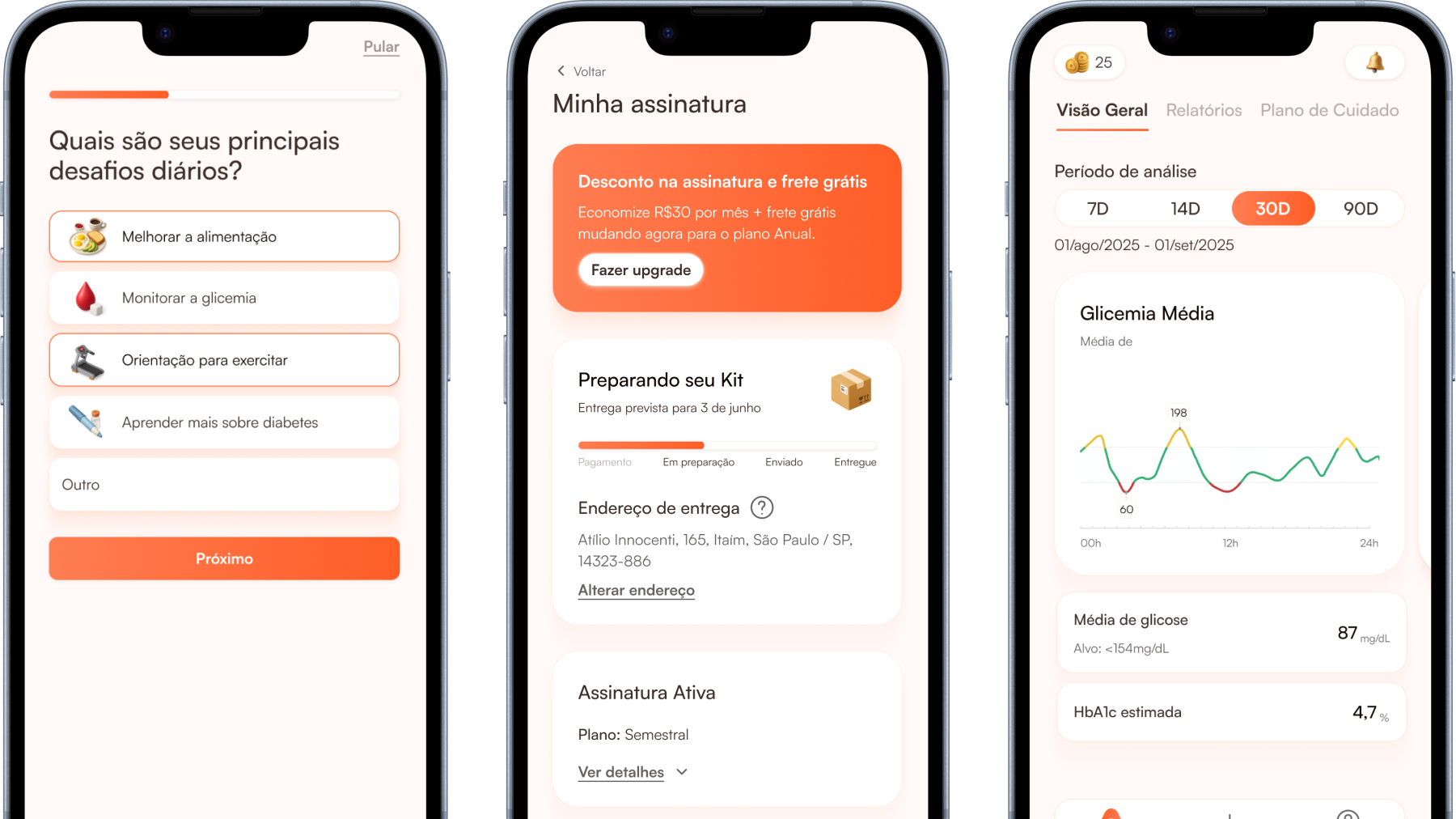
The Outcome
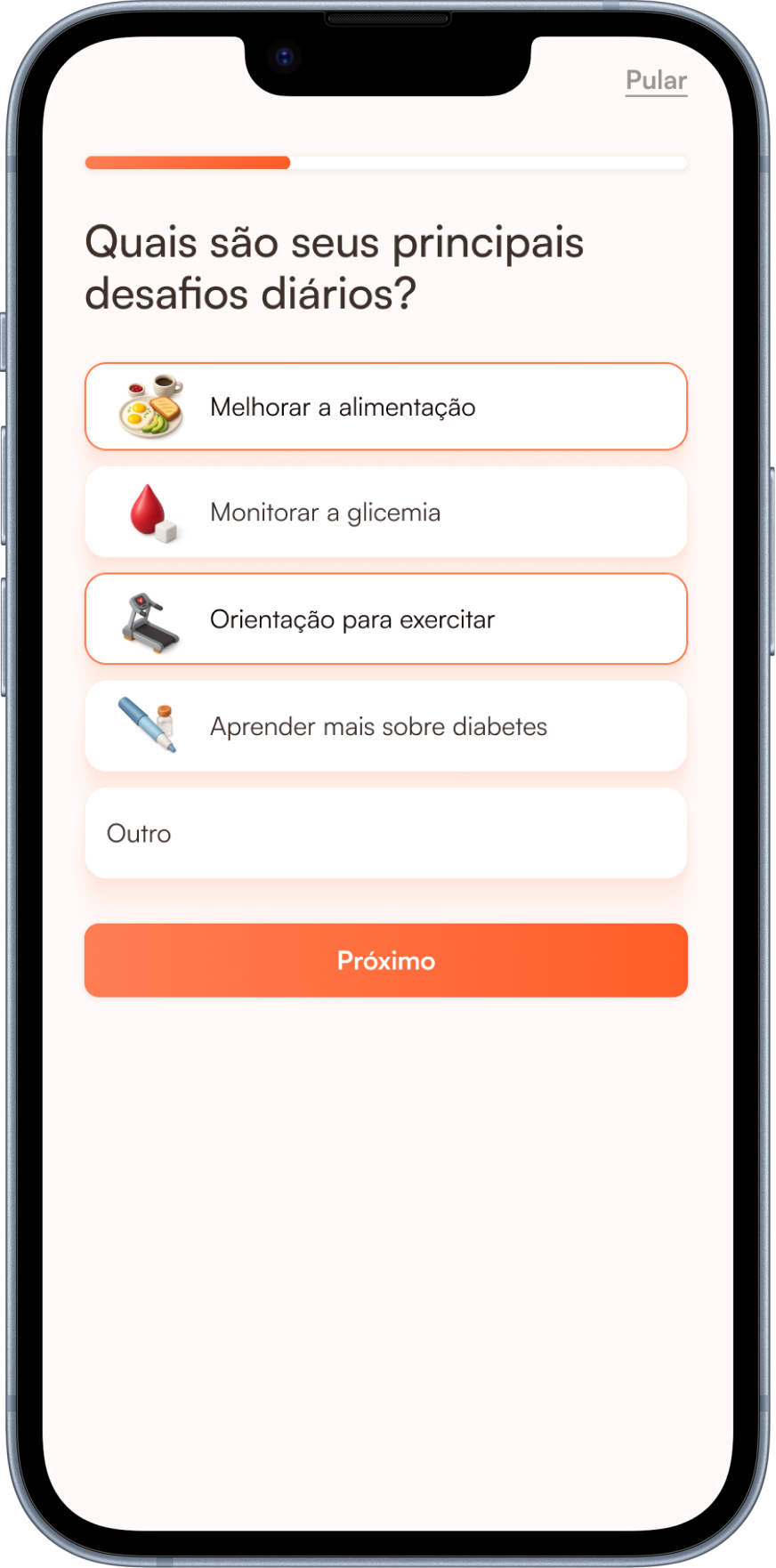
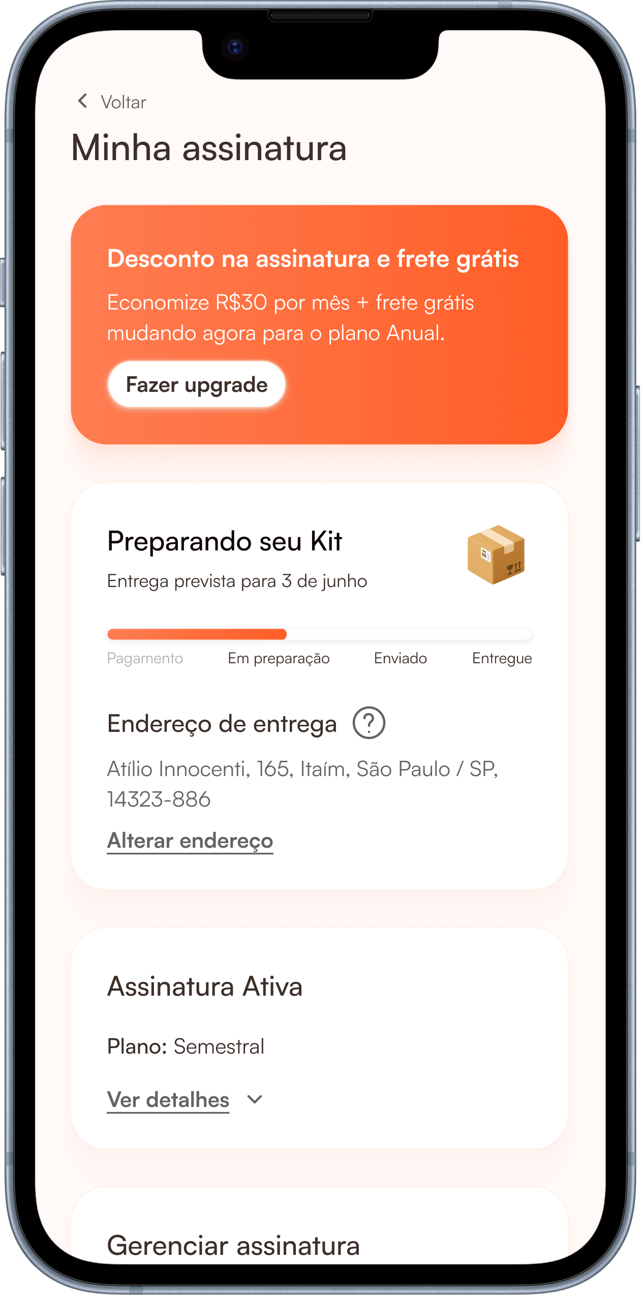
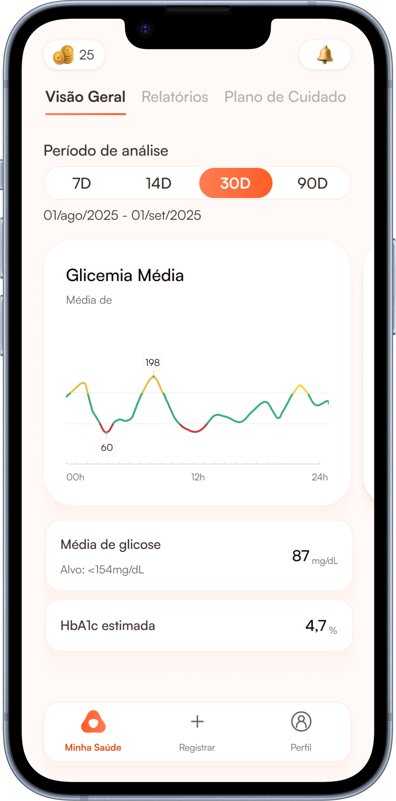
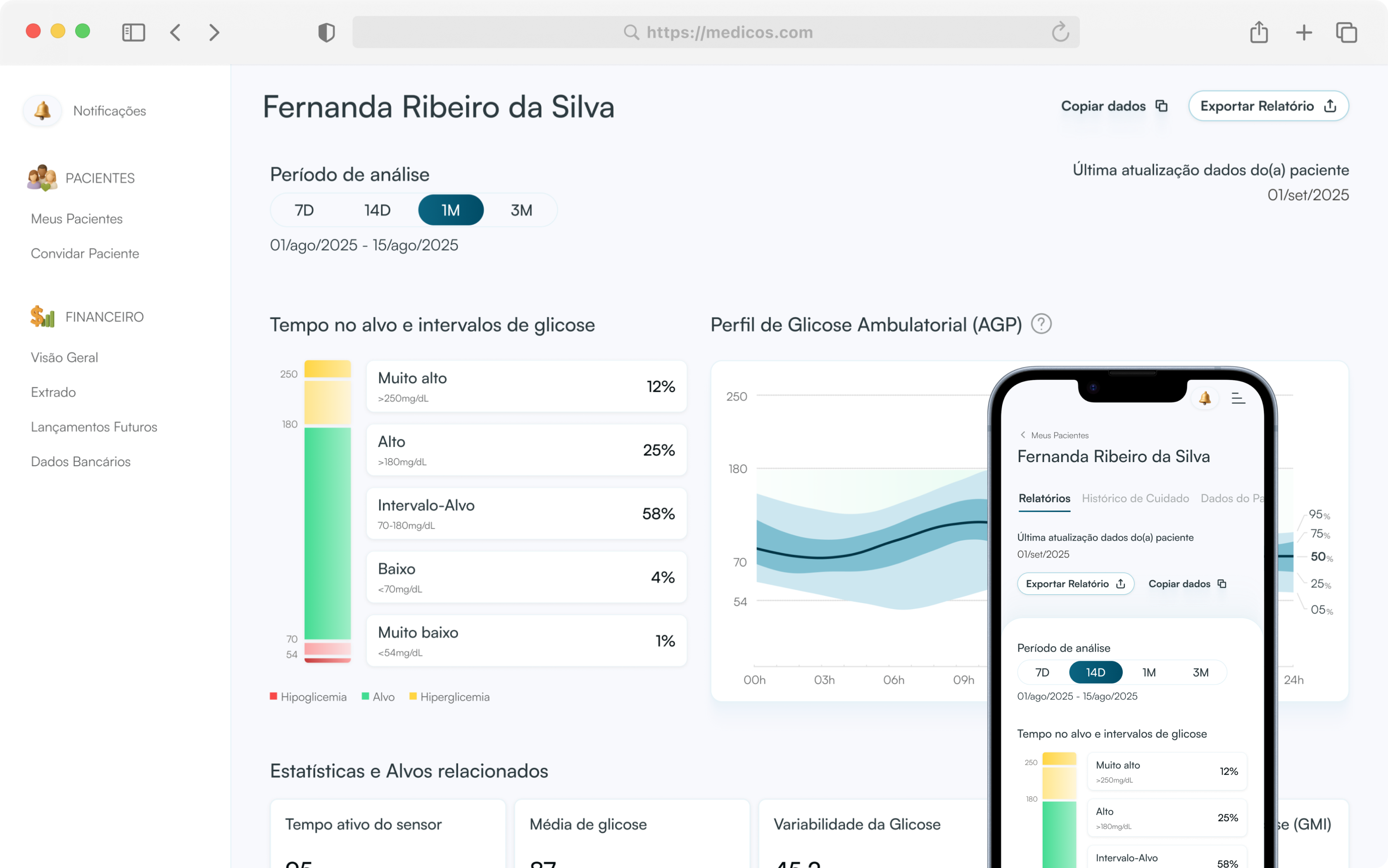
- Established consistent visual language across app and web products.
- Reduced friction with engineering through a shared component library.
Defining design standards and building digital products
Created company’s first digital design patterns, unifying the brand across web and mobile products for doctors and patients through clear visual standards and scalable components.
Context
This early-stage healthtech startup had only a logo and color palette, created by a communication agency.
There were no digital design guidelines, resulting in fragmented experiences across web and mobile products for doctors and patients.
Challenge
Create a cohesive visual and interaction identity that could unify multiple digital products under the same brand feeling — while reflecting company's mission of combining trust, technology, and care.
Calorias
#CB5730
Carboidratos
#EBA870
Passos
#CFA68A
Exercícios
#638B10
Insulina
#6AB6B0
Sono
#3C5558
Água
#0F779B
Reuniões
#BBC0E5
Coração
#FF9A94
Design Process
I started by facilitating workshops with company leadership to define the core brand attributes we wanted to express through digital design.
Then, I conducted competitive benchmarking to analyze how healthcare brands positioned themselves visually across doctor- and patient-facing products.
Based on those findings, I built the design patterns foundation, including color tokens, typography scales, component structure, and accessibility guidelines.
Key insights
- For medical audiences, a technological and reliable tone was expected.
- For patients, a warmer and more welcoming visual language stood out as a differentiator.
The Outcome
- Established consistent visual language across app and web products.
- Reduced friction with engineering through a shared component library.